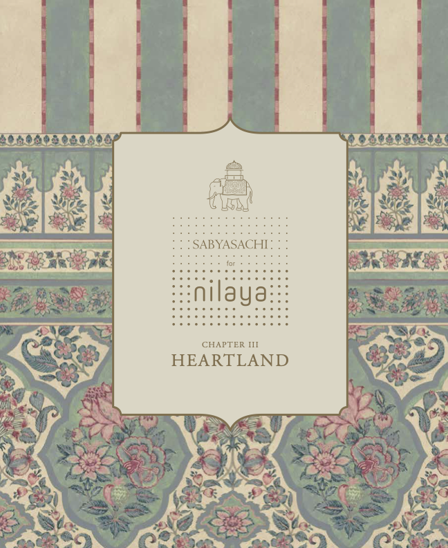
HEARTLAND
Curation and visual strategy under ︎︎︎Pavitra Rajaram for a lifestyle collection of interior fabrics and wallpapers launched by ︎︎︎Asian Paints and ︎︎︎Sabyasachi
over-view
Heartland is a collection of home textiles and wallcoverings that uphold values of ethical production, fair trade, and sustainability while maximizing outreach and appealing to a broad range on consumers to revolutionize the world of Indian home furnishings.
This project was a collaboration across time zones and cities during the height of the CoVID-19 pandemic. My role was specific to the work done by ︎︎︎ Pavitra Rajaram Design—largely, concept curation, brand strategy, and visual mechandizing strategy.
Learn More ︎︎︎
Watch the ‘Making Of’ Heartland ︎︎︎

“After all, at the heart of every home is the story of the people who inhabit it, make it and shape it just the way they like it. Layer it with well-loved elements and their distinct styles.”
— Sabyasachi Mukherjee
Indian Fashion Designer
︎︎︎ Bring Home Sabyasachi’s Gorgeous Designs with this Collection of Home Furnishings by Asian Paints (Architectural Digest)
︎︎︎Asian Paints and Sabyasachi Mukherjee Launch Designer Home Furnishings (Vogue India)
︎︎︎Seize a Feeling of Longing Through The Furnishing Fabrics Collection Created by Sabyasachi for Nilaya by Asian Paints (Elle Decor)
︎︎︎Sabyasachi on Your Sofa (The Hindu)


CURATING THE COLLECTION
Developing a concept and its visual and written collateral by consolidating and stategizing color stories, designs, and styles to attract global and local consumers.
CONCEPT DEVELOPMENT:
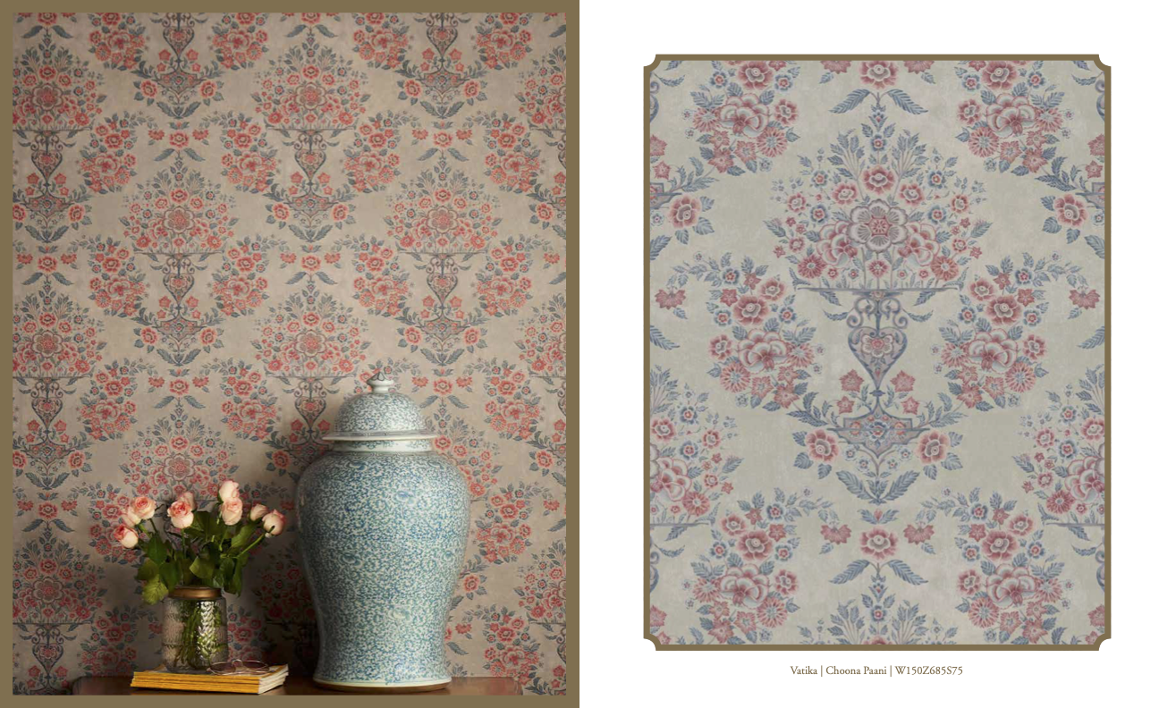
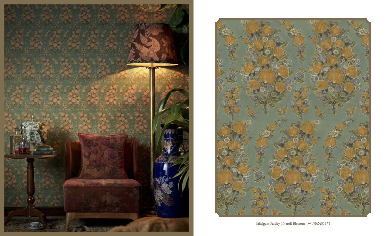
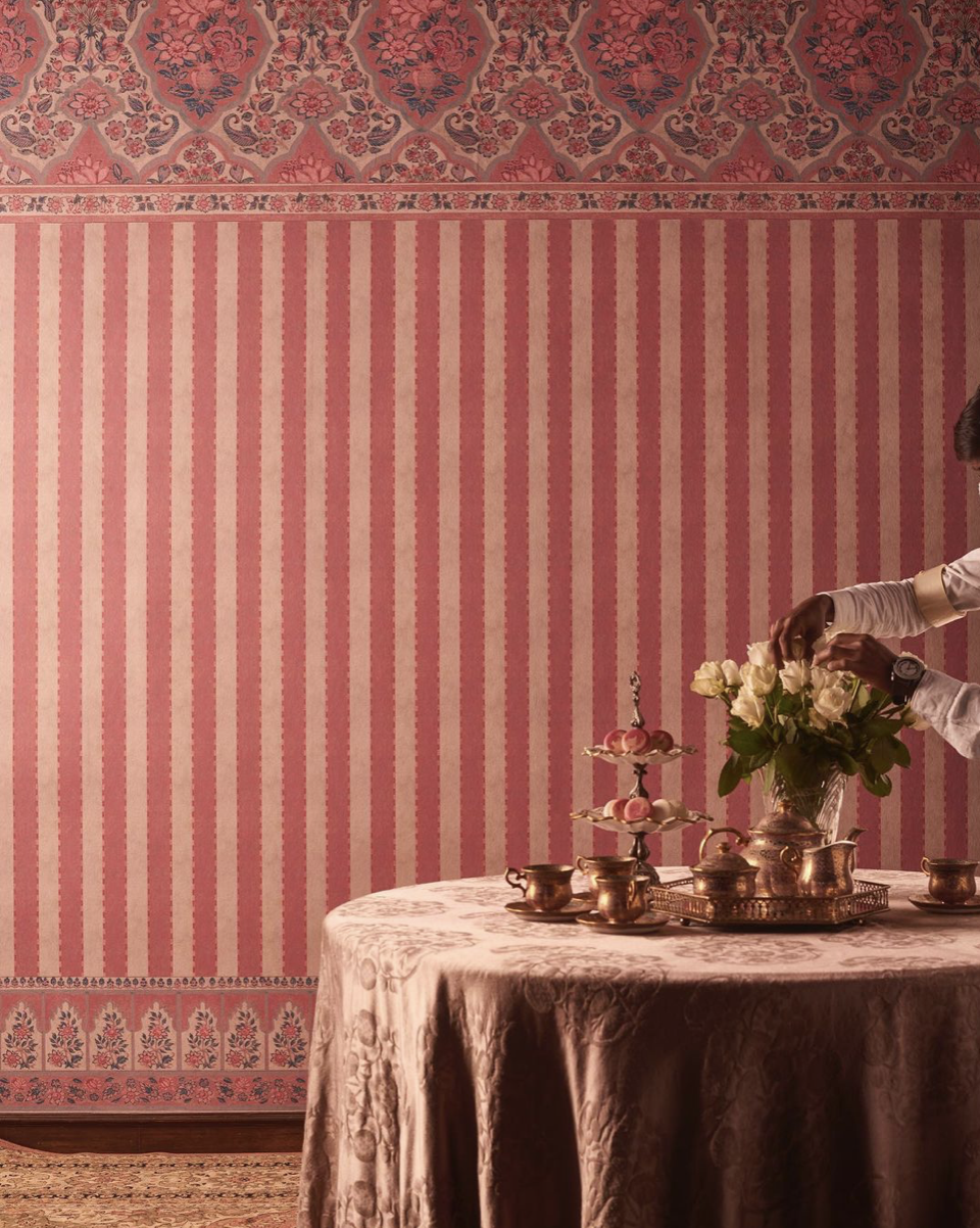
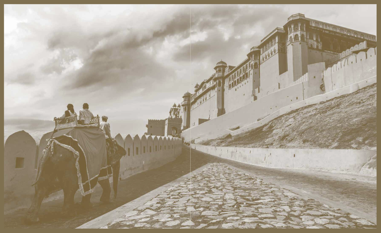
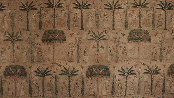
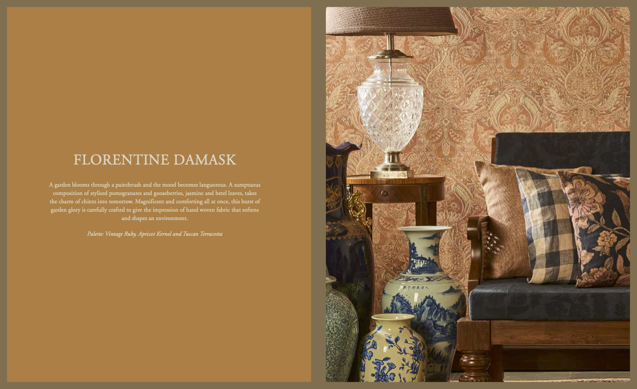
This couture collection is a constant celebration of the duality of maximalism and minimalism in Indian design. It focuses on celebrating textiles and transforming ancient textiles into modern silhouettes by using indigenous techniques like hand-dying, embroidery, and block printing. The collection inspires textures and weaves found in North African homes in Morocco and Tunisia to the pomp, pageantry, and vibrance of color witnessed daily in cities such as Vrindavan, Jaipur, and Kolkata.
The collection is inspired by the idea of home, and the emotions of hope, love, and memory attached to it that create an ephemeral idea and intangible sensory impact.
The smells and sights associated with childhood, such as wafts from the kitchen of a favorite dish being made by one's mother or the touch of the warmest hug by a family member. It brings together joys, sorrows, solitude, and bittersweet melancholy that take one back to a home where you always belong.


COLOR DEVELOPMENT:
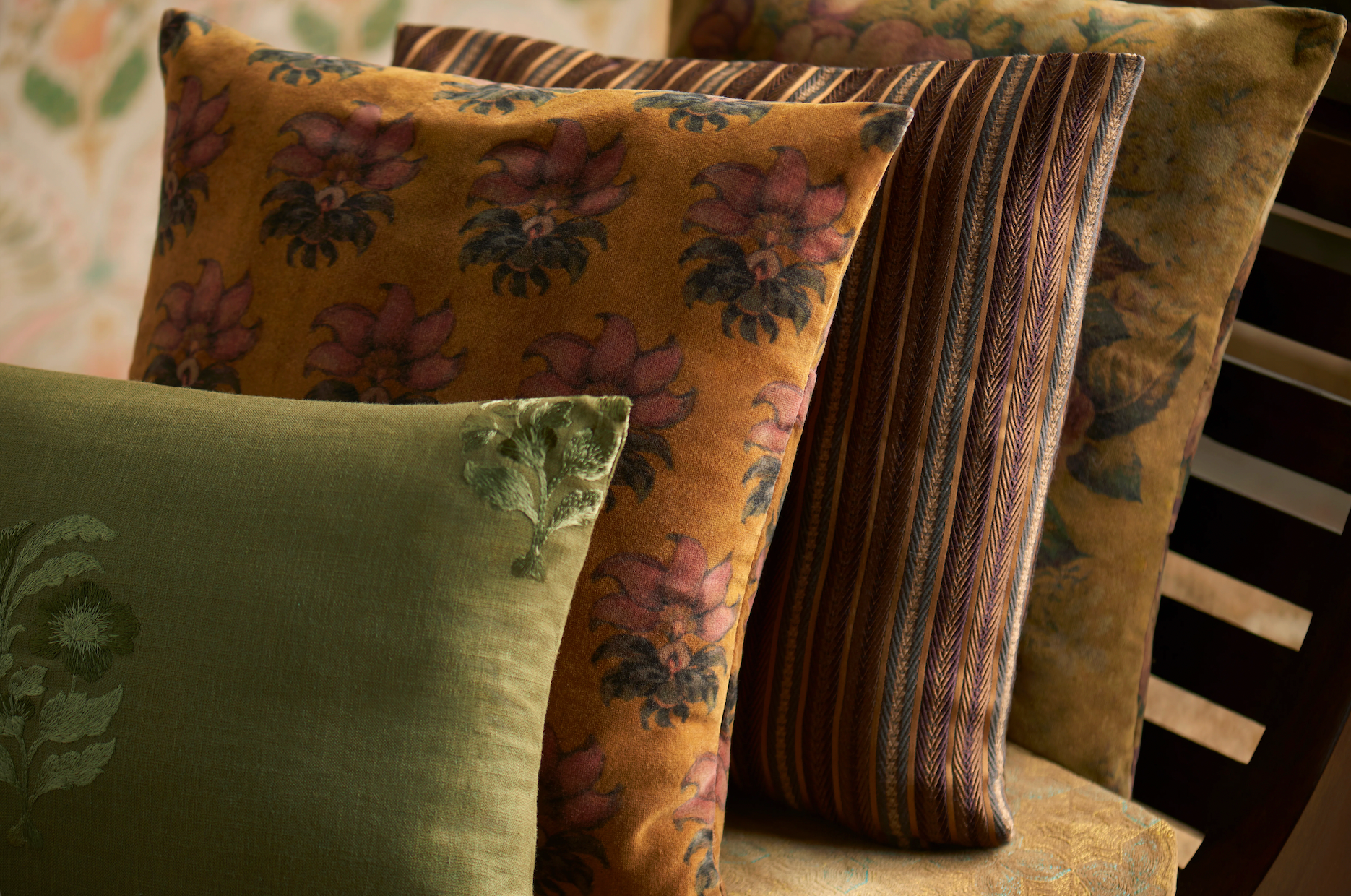
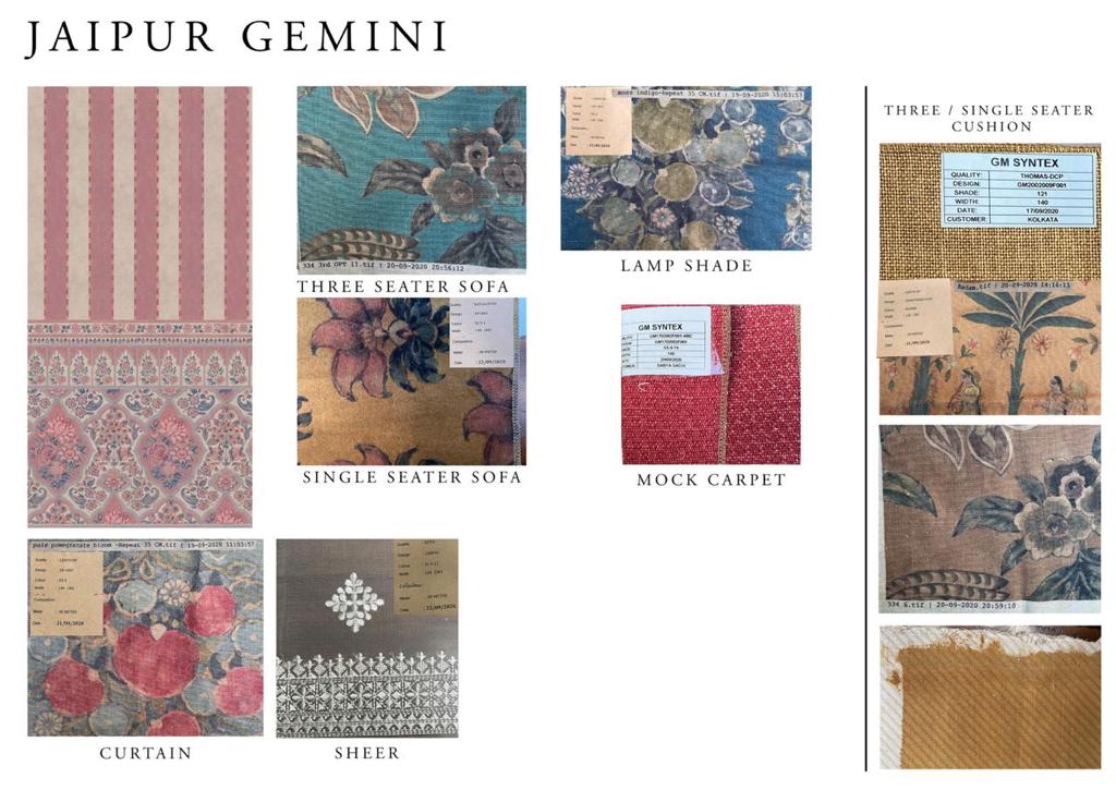
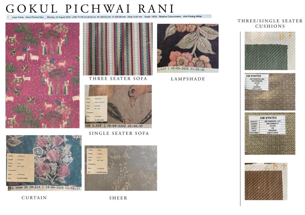
Part of the marketing strategy included curating the designs such that strategic color choices were taken to market to maximize sales and appeal to the broadest consumer base possible (North India and South India were targeted seperately based on the varying aesthetic choices seen in different regions). A variety of selections, from pastel palettes to bolder palettes were curated to allow even the independent home decorater to make easy choices when buying product.


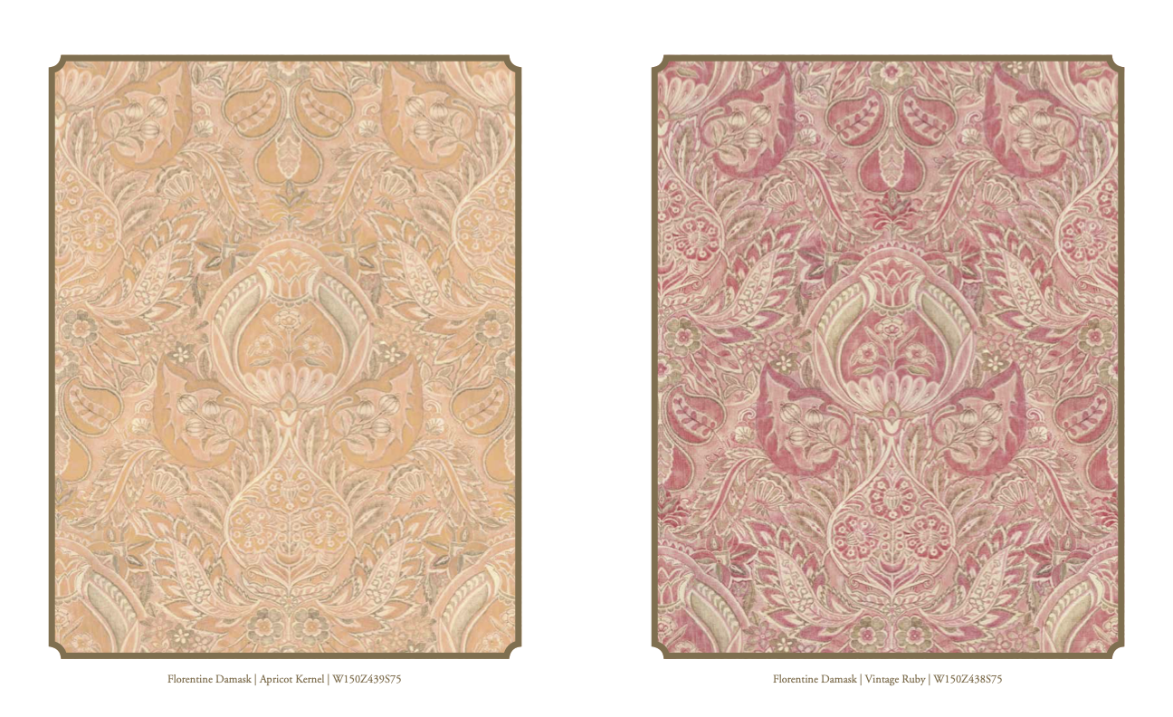
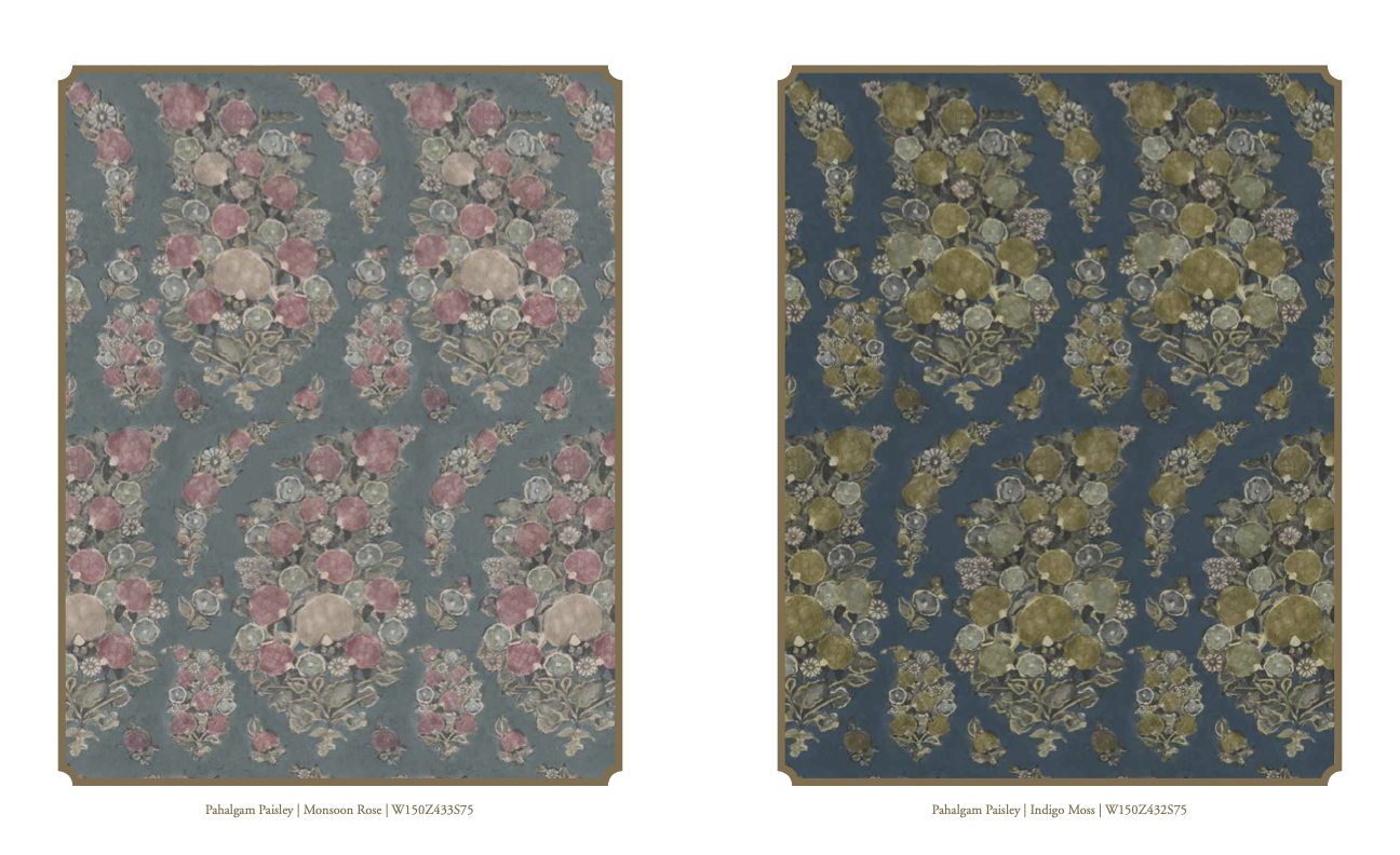


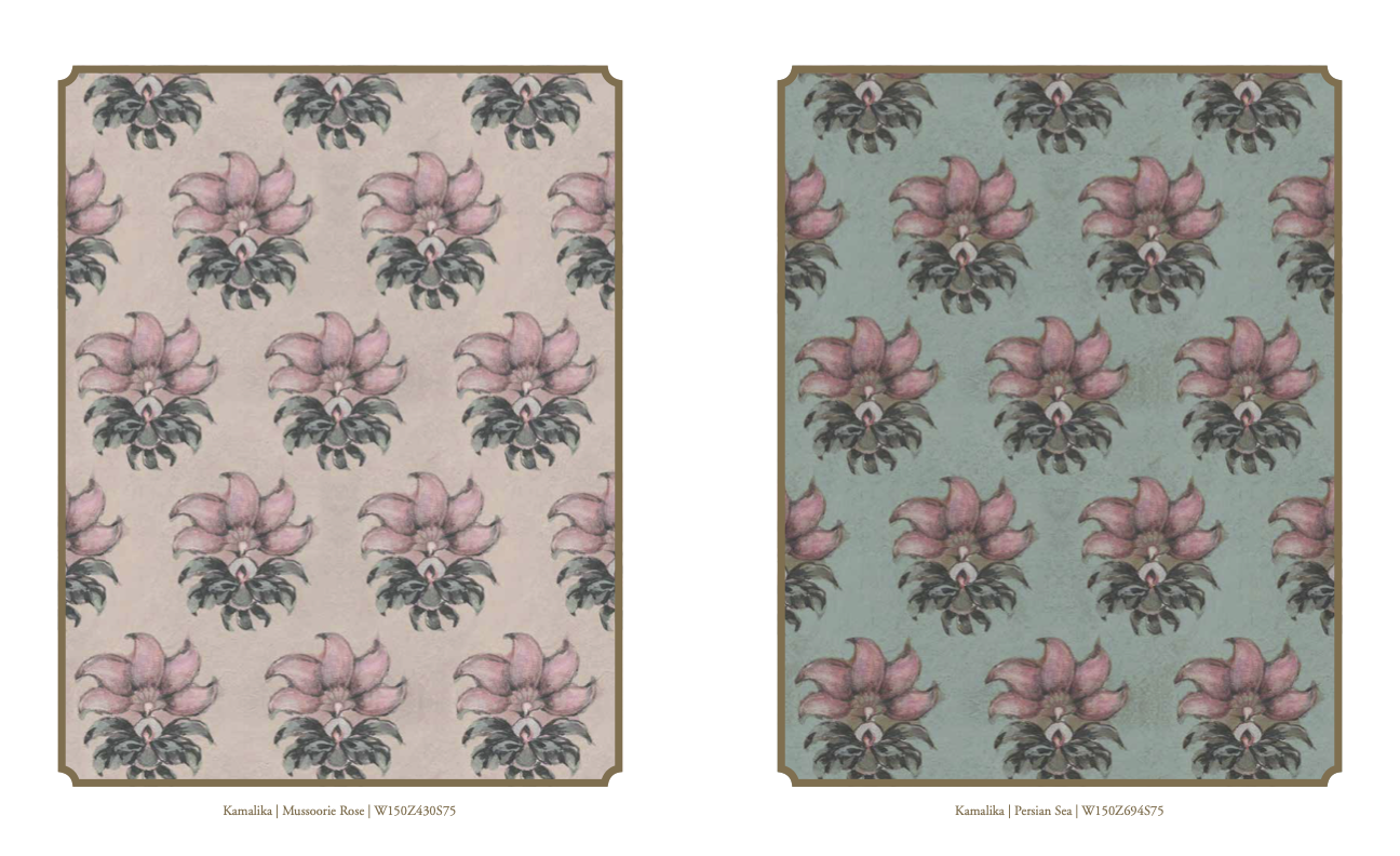


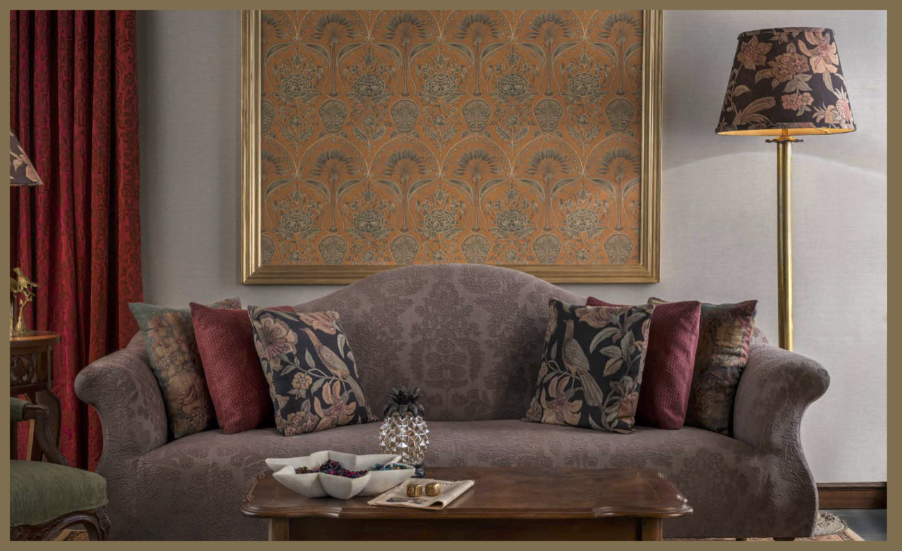
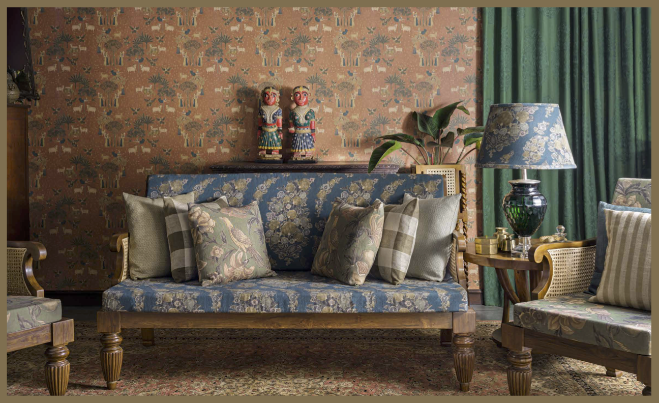
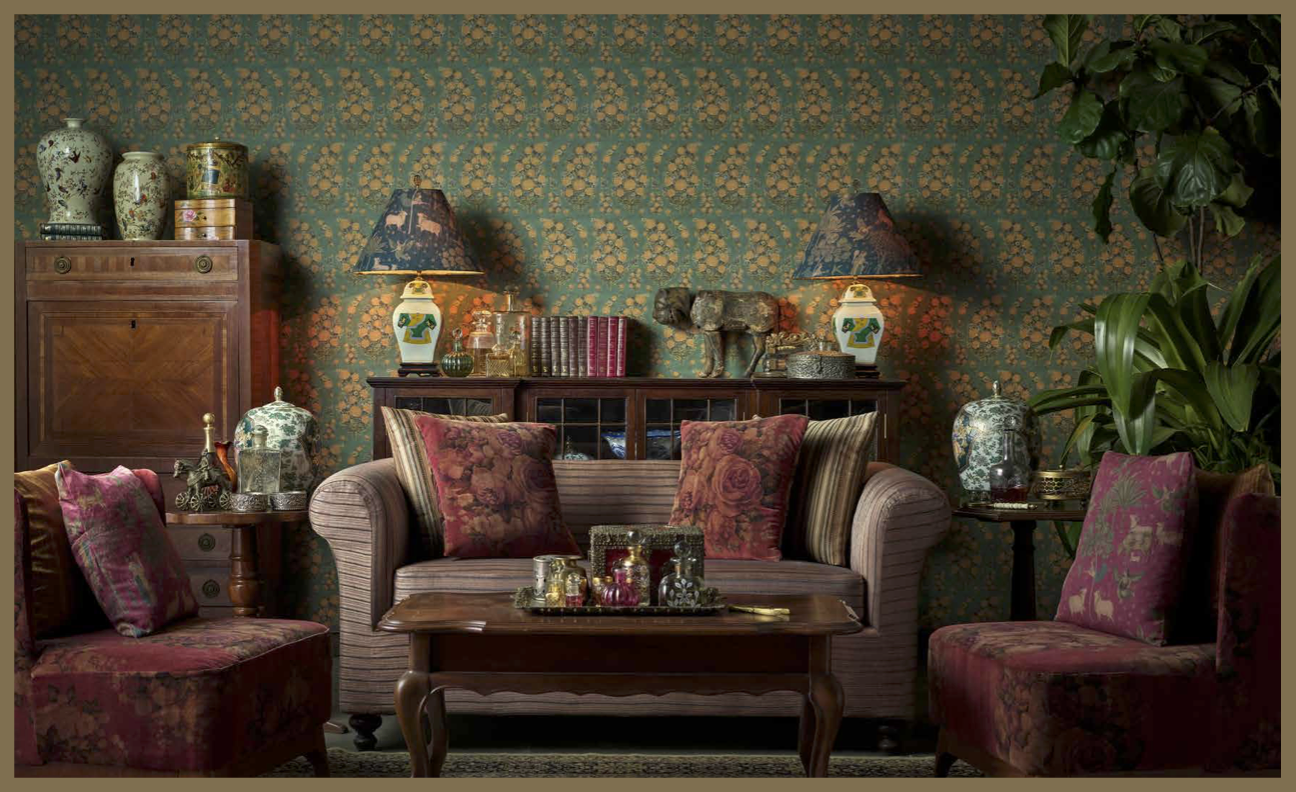
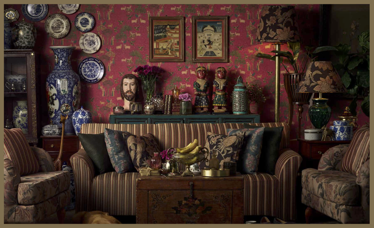
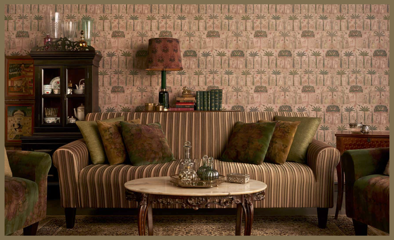
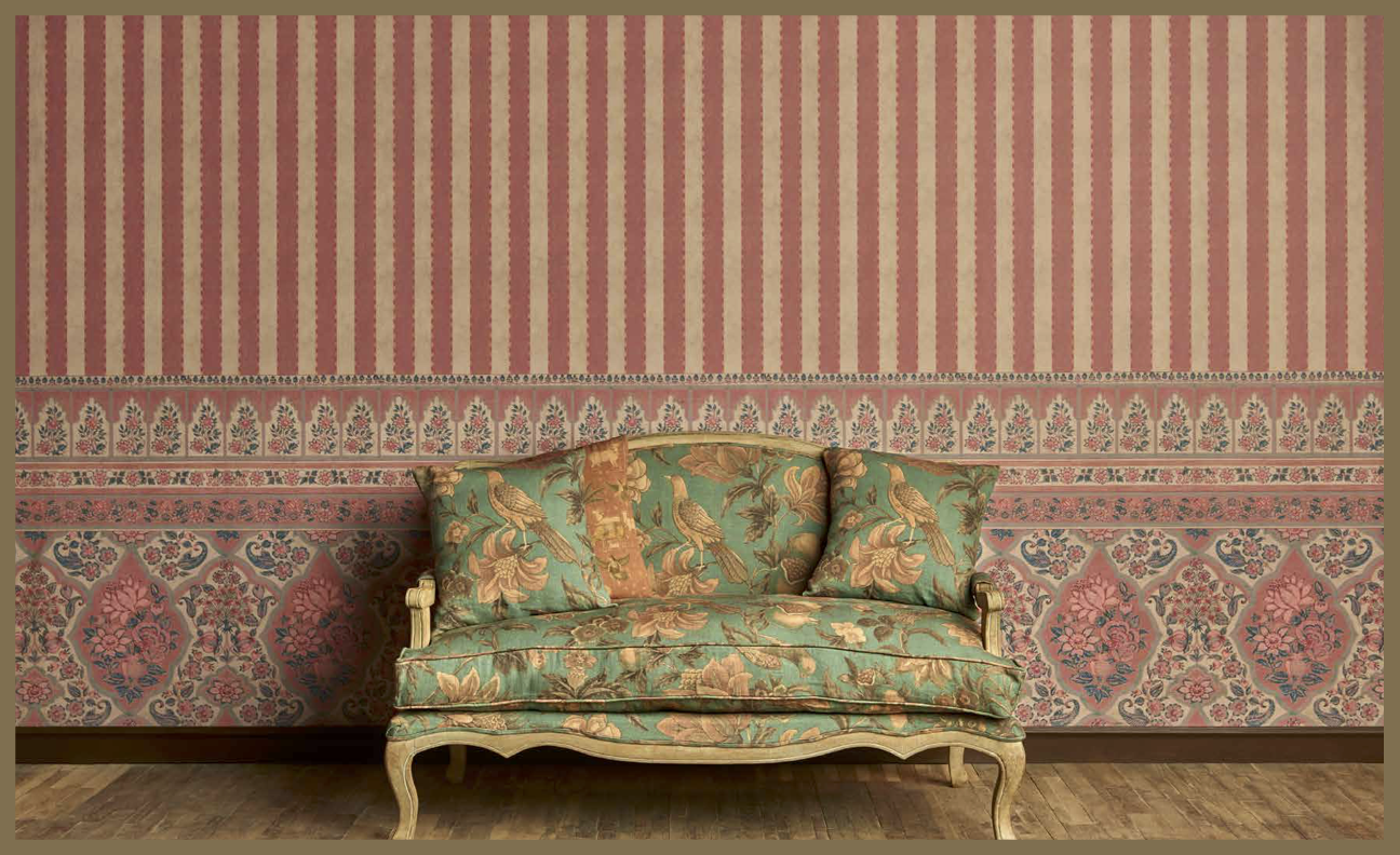
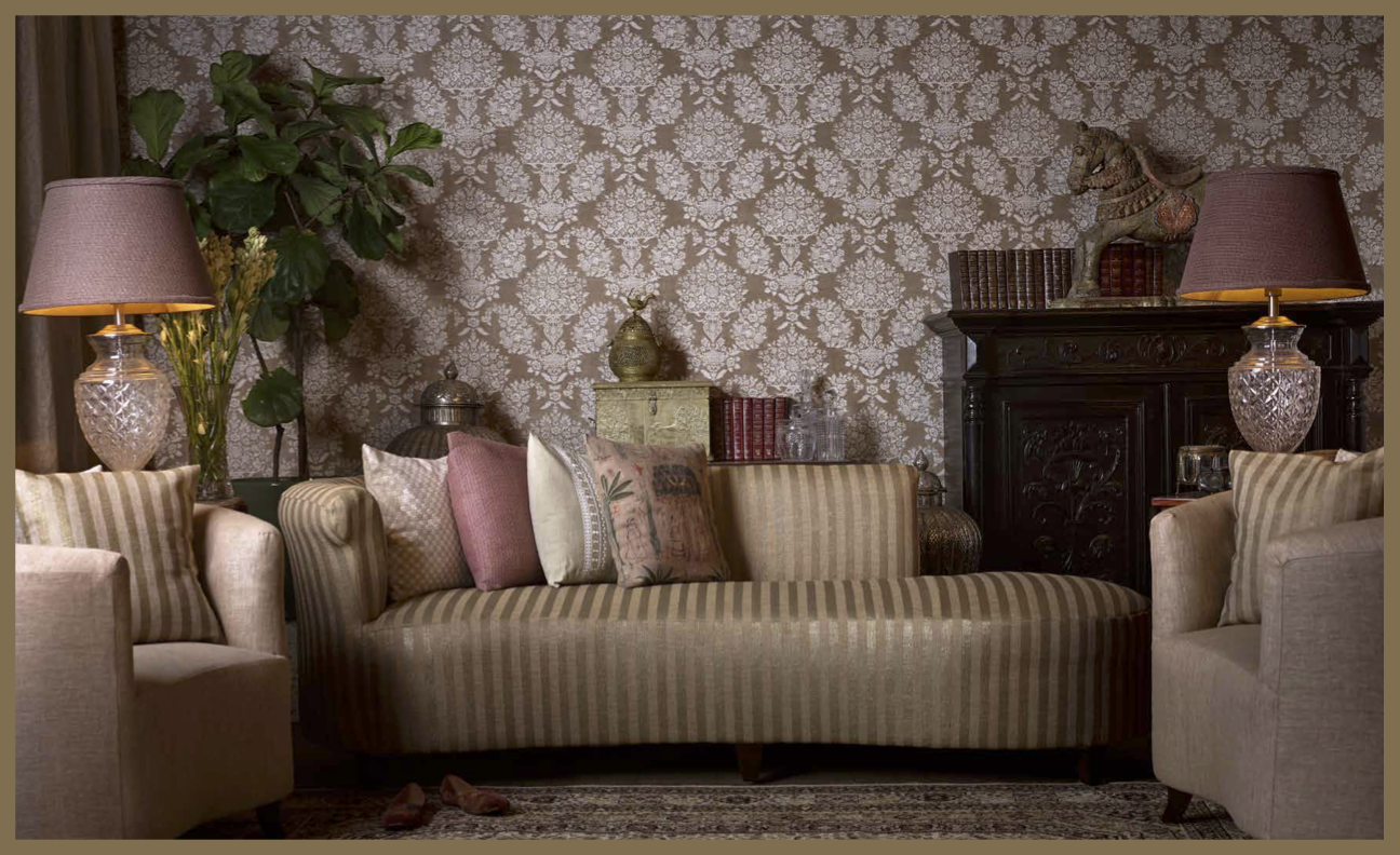
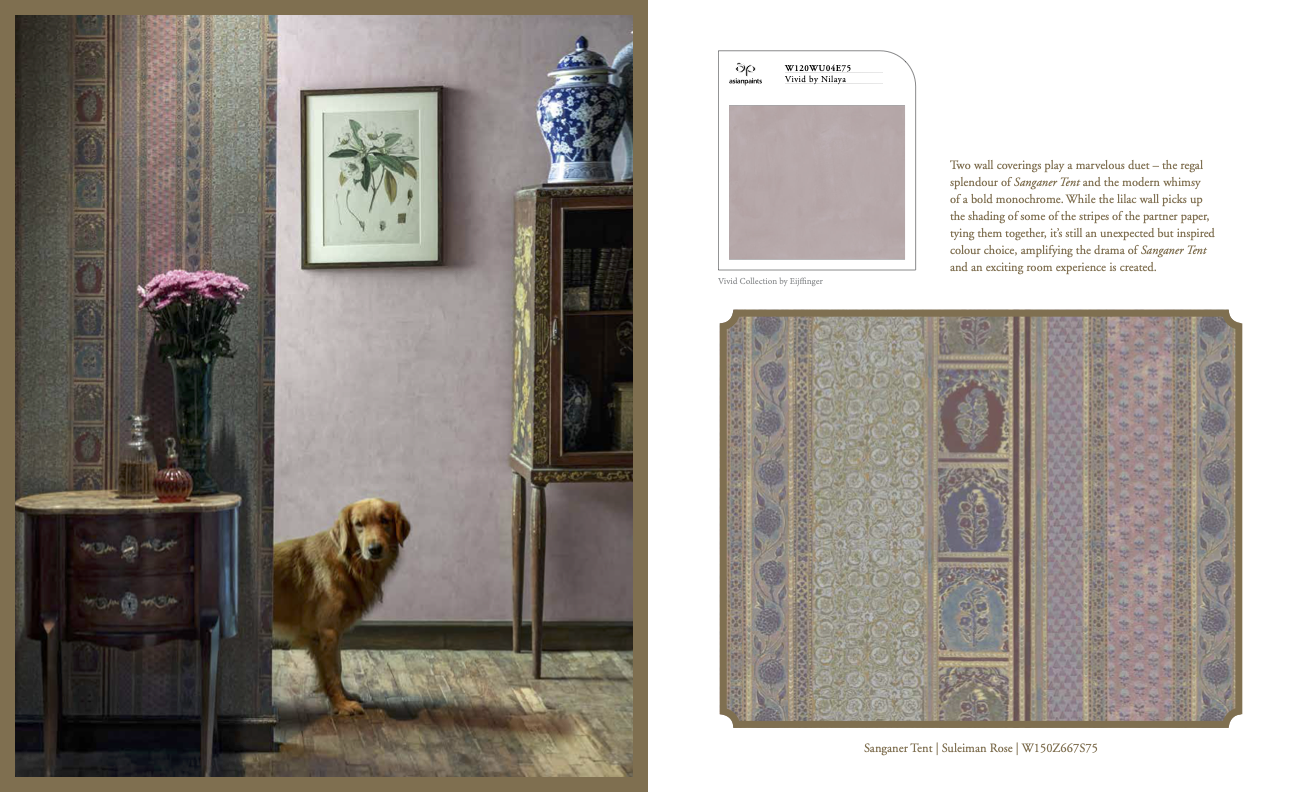
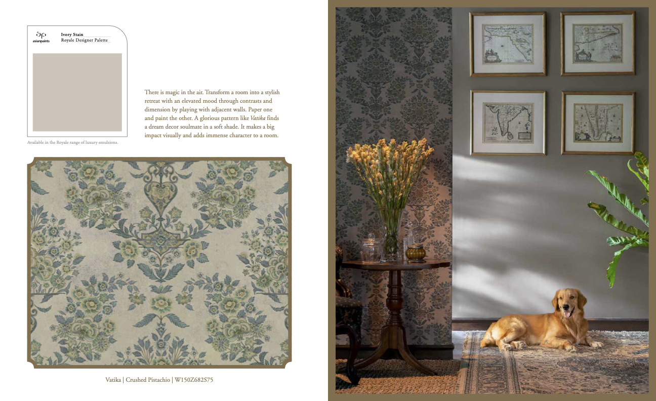
PAINT / WALLPAPER PAIRINGS
![]()
![]()
![]()
![]()
![]()
![]()
CUSTOM PAINT CHIPS


PROTOTYPINING & SAMPLING
Collaborating and efficiently communicating with global factories and vendors to iterate new samples based on market fit and factory production capabilities.
THE SURFACE PRINT COMPANY
The Surface Print Company is located in Lancashire, the heart of the wall covering industry. Their facilities employ a variety of time-honored and cutting edge printing methods facilitated by master craftsmen. Flexo and modern digital printing techniques in an ecologically responsible production process were used in the production of the wallcovering.
G. M. SYNTEX
In line with the ‘Made in India’ government initative, the fabric collection was manufactured by a reputable textile house located in Maharashtra. They produce textiles in an ethical and sustainable manner through the use of time-tested handcrafting techniques that are combined with modern textile manufacturing equipments and machinery.
BRANDING
Creating a style guide with an elegant and sophisticated aesthetic embodied by appropriate fonts, colors, and compositions.
The fonts, iconography, and placements were made minimalist and modern to complement the traditional and maximalist designs of the products themselves.


HEARTLAND BOOK COVER
WALLCOVERING LOOK BOOK LAYOUT


PROJECT DETAILS
Client:
Team:
Skills:
Reflection:
Asian Paints x Sabyasachi — for Pavitra Rajaram Design
Asian Paints is India’s leading and Asia’s third largest paint company trusted for its outstanding paint products which include a range of innovative solutions. We operate in 15 countries and have 26 paint manufacturing facilities in the world, servicing consumers in over 65 countries.
︎︎︎ Read More
Indian fashion designer Sabyasachi Mukherjee is the first Indian designer to show at Milan Fashion Week. His self-made apparel company with a lucrative bridal business, as well as important Bollywood costume projects is world-renowned. He recently collaborated with H&M, Starbucks, and Pottery Barn to name a few, with exclusive premieres at Bergdorf Goodman. As an artist and designer who thrillingly merges old worlds with the new, and with the Sabyasachi Arts Foundation which contributes greatly to keeping India’s crafts traditions dynamic and relevant, Sabyasachi’s influence on Indian design cannot be overestimated.
︎︎︎ Read More
Team:
This project was undertaken during my internship with Pavitra Rajaram Design (PRD).
Pavitra Rajaram, is the Decor Custodian for Asian Paints and was the lead on this project.
Tanish Malji was my supervisor.
The work was closely executed with executives specifically Amit Syngle (CEO of Asian Paints) and Sabyasachi Mukherjee (Founder of Sabyasachi), and the 3-day shoot was planned with the teams of Divya Palat (Owner of Balancing Act Group) and Shruti Gupte (Production Designer).
Skills:
Project Management, Visual Merchandizing, Concept Development, Collection Curation, Branding, Visual Identity Creation, Instagram Campaign Development, Photography Composition, Set Styling, Manufacturing
Reflection:
There is so much to learn, as long as you have an open mind.
During this project, I was surrounded by many people who continued to inspire me, and teach me a lot. My understanding on the industry was greatly shaped by coversations I had with the people working on this project.
Keep listening.
Just by the mere act of listening, I found myself learning a great deal about the trade, process of design, and industry, from the giants in the industry, who I was surrounded by duringg this project.
Sometimes you need to put in long hours, and stay patient through it all.
The long work days, 8am till midnight, most days, taught me a lot about staying patient and endearing while working at all time– remembering that there is a lot to learn!
Disclaimer:
* THIS WORK WAS UNDERTAKEN DURING AN INTERNSHIP WITH PAVITRA RAJARAM DESIGN
** ALL WORK PRODUCT BELONGS TO ASIAN PAINTS
*** CONTENT ON THIS PAGE HAS BEEN TAKEN FROM ASIAN PAINTS, NILAYA, SABYASACHI, SURFACE PRINT COMPANY, G. M. SYNTEX, ARCHITECTURAL DIGEST